Etsy listing photos fail most often at the thumbnail stage. A product can look clear in the editor and still appear cropped, soft, or confusing in search results. The fix is not a prettier filter. It is a safe-zone workflow: start with enough pixels, keep the selling detail near the center, and make the first photo survive both square and horizontal thumbnail views.
The Etsy Photo Rules That Actually Matter
Etsy's own Help Center gives sellers a few hard anchors:
| Requirement or Recommendation | Practical Meaning |
|---|---|
| Listing photos should be at least 2000 px wide and high | Build from a 2000 x 2000 px or larger source file |
| First photo should be at least 635 px wide and high | Anything smaller risks lower search visibility and poor cropping |
| Supported image types include JPG, GIF, PNG, SVG, and HEIC | Use JPG or PNG for predictable product photos |
| Animated GIF and transparent PNG are not supported as expected | Do not rely on animation or transparent backgrounds |
| Images over 1 MB may upload slowly on weak connections | Compress intelligently, but do not destroy detail |
| First photo should be horizontal or square | Avoid portrait-first crops unless the product needs it |
Those rules are the baseline. The real seller problem is that Etsy uses listing images in different contexts: search cards, shop grids, ads, listing pages, favorites, and mobile views. You are not designing one image. You are designing one source image that gets cropped and resized repeatedly.
The Safe-Zone Template
Use this mental template for your first listing photo:
| Zone | Area | What Goes There |
|---|---|---|
| Core zone | Center 70% of the image | Product, main shape, primary detail |
| Caution zone | Outer 15% on each side | Background, props, shadow, extra breathing room |
| Risk zone | Outer 5-10% edges | Nothing important |
For a 2000 x 2000 px image, that means:
| Pixel Area | Safe Use |
|---|---|
| 0-200 px from any edge | Keep empty or background only |
| 200-300 px from any edge | Props and non-critical context |
| 300-1700 px horizontally and vertically | Product and important detail |
This does not mean every photo must be boring and centered. It means the first image should still work when Etsy trims the edges. Your secondary gallery can include close-ups, detail crops, lifestyle scenes, and process shots.
First Photo Layouts by Product Type
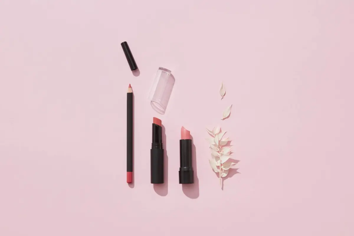
Jewelry
Small reflective products disappear in thumbnails. The hero image needs more product scale than most jewelry sellers use.
| Element | Safe-Zone Rule |
|---|---|
| Product position | Centered or slightly above center |
| Fill | 65-80% of image width for necklaces and bracelets; 45-60% for rings |
| Props | One surface texture max |
| Text | Avoid text on the first photo |
| Measurement cue | Put size reference in photo 2 or 3, not the thumbnail |
If the product is tiny, do not zoom so far that buyers lose scale. Pair the hero with a worn photo and a measurement photo later in the gallery.
Digital Downloads and Printables
Digital sellers often overload the first image with text. Etsy thumbnails make small text useless.
| Element | Safe-Zone Rule |
|---|---|
| Main mockup | Keep inside center 70% |
| Text | 3-5 words max if you use any |
| File details | Move to photo 2 or description |
| Color variants | Use a later comparison image |
| Border | Avoid thin borders near the edge |
The first image should answer "what is this style?" not "what is every file included?"
Apparel
The main risk for apparel is cutting off sleeves, hems, or the model's head in thumbnail views.
| Element | Safe-Zone Rule |
|---|---|
| Product or model | Full silhouette inside center 80% |
| Background | Leave extra room above head and below hem |
| Fit detail | Use secondary close-ups |
| Size label | Do not burn into the hero image |
| Color | Use natural light and sRGB export |
For garments, include a flat-lay or front-facing shot in the gallery even if the hero image is lifestyle. Buyers need a clean view before they commit.
Furniture and Home Decor
Large products need context, but context can overpower the item in a small card.
| Element | Safe-Zone Rule |
|---|---|
| Product | 55-70% of visual weight |
| Room props | Background only, never blocking edges |
| Scale cue | Include a recognizable object or room element |
| Dimensions | Use a separate annotated image |
| Crop | Leave floor and top clearance |
For wall art, avoid putting the art too close to the top edge of the frame. In cropped grids, that makes the piece look chopped.
The 10-Photo Etsy Gallery Plan
Etsy gives you room to answer buyer questions visually. Use the first photo for the click, then use the rest to reduce doubt.
| Slot | Purpose | Image Type |
|---|---|---|
| 1 | Earn the click | Safe-zone hero image |
| 2 | Show full product clearly | Clean front or flat-lay shot |
| 3 | Show scale | Product in hand, on model, or in room |
| 4 | Prove texture or material | Close-up detail |
| 5 | Show variations | Color, size, pattern, finish |
| 6 | Explain dimensions | Measurement image or annotated photo |
| 7 | Show use case | Lifestyle or styled image |
| 8 | Show packaging or contents | What arrives in the box |
| 9 | Show customization | Personalization example if relevant |
| 10 | Answer final friction | Care, installation, gift-ready state |
The first image should not carry all the information. It should make the right buyer click. The remaining images should help that buyer make a confident decision.
How to Build the First Image
Step 1: Start Larger Than the Minimum
Use 2400 x 2400 px or 3000 x 3000 px if your original file supports it. Etsy recommends at least 2000 px wide and high, but starting larger gives you room to crop without falling below the quality threshold.
Avoid upscaling a weak image. If a source photo is soft at 1200 px, exporting it at 3000 px will not add real detail. It only gives Etsy a bigger blurry file.
Step 2: Crop Square First, Then Check Horizontal
Even when you use a landscape first photo, test the square crop. Open the image in any editor and check:
- Square crop
- 4:3 horizontal crop
- Mobile thumbnail preview at 200 px wide
- Dark mode and light mode backgrounds if your product is white
If the product loses its main detail in any crop, move it inward or zoom out.
Step 3: Remove Edge-Dependent Information
Do not put these near the edge:
- Product name
- Size text
- Sale wording
- Important pattern detail
- Model face or hands if they explain use
- Product corners or legs
- Watermarks or logos
If a detail matters, it belongs in the core zone.
Step 4: Export in sRGB
Etsy notes that CMYK is for print and that sellers should convert to sRGB if colors look wrong. This matters for apparel, art prints, stationery, and handmade goods where color mismatch creates refund requests.
Use this export setup:
| Setting | Recommendation |
|---|---|
| Color profile | sRGB |
| Format | JPG for photos, PNG for sharp graphics |
| Long side | 2400-3000 px if source is sharp |
| File size | Aim near or under 1 MB when possible |
| Sharpening | Light output sharpening only |
Do not compress until fabric texture, paper grain, or small product details vanish. Upload speed matters, but an image that no longer proves quality is worse.
Thumbnail Test: Five Checks Before Upload
Run the first photo through this checklist:
| Check | Pass Standard |
|---|---|
| 200 px thumbnail | Product is recognizable in one second |
| Center crop | No important part is cut off |
| Edge safety | Outer 10% contains no critical detail |
| Color | Looks natural after sRGB export |
| Authenticity | First image shows the real finished item when Etsy requires it |
If the image fails at 200 px, it will fail in search. Fix the crop before editing color or adding styling.
Common Etsy Photo Mistakes
Mistake 1: Using the First Photo Like a Poster
A poster-style graphic can look good full size and fail in search. Etsy shoppers scan cards quickly. Use the hero image to show the product, not to explain the entire offer.
Mistake 2: Placing Text Where Crops Will Cut It
If you must use text, put it in the center and keep it short. Better: use photo 2 or 3 for explanatory text and keep the hero clean.
Mistake 3: Uploading Transparent PNGs
Etsy says transparent PNG areas can appear black. For product photos, flatten the image onto a real background before upload.
Mistake 4: Relying on Mockups for the Main Image
Etsy's listing image policy requires original photos of the actual product in many cases. For personalized items, the first image must show a finished customized item similar to what the buyer will receive, not a blank placeholder. Mockups may be allowed later in the gallery for certain production-partner or customization contexts, but the main image should not mislead.
Mistake 5: Forgetting That One Image Sets the Gallery Shape
Etsy says the first listing photo dictates the shape of the photos that follow. Mixed shapes can make the gallery feel messy. Pick a dominant ratio for the set, then use detail crops intentionally.
FAQ
What is the safest Etsy listing photo size in 2026?
Use at least 2000 x 2000 px for listing photos, and start from 2400 x 2400 px or 3000 x 3000 px when your source image is sharp. Keep the product inside the center 70-80% so thumbnails do not crop important detail.
Should Etsy first photos be square or horizontal?
Square is safest for sellers who want predictable thumbnails. Etsy also says the first photo can be horizontal. Portrait-first images are riskier because important top and bottom details can be cropped in some views.
Can I put text on my Etsy hero image?
You can, but it often hurts thumbnail clarity. If you use text, keep it short and centered. Put file details, dimensions, options, and care notes in secondary images or the listing description.
Do Etsy sellers need real photos instead of mockups?
Often, yes. Etsy's policy says sellers must use original photos of the actual product buyers will receive, with limited exceptions. Personalized items need a finished customized item in the first image. Use mockups carefully and only where Etsy's policy allows them.
Where should dimension graphics go in an Etsy gallery?
Put dimensions in slot 6 or another secondary slot, not the first photo. The first photo should sell the click. A clean annotated measurement image later in the gallery helps buyers confirm fit, scale, and compatibility without cluttering the thumbnail.
Sources & References
- Requirements and Best Practices for Images in Your Etsy Shop — Etsy Help Center
- The Ultimate Guide to Product Photography — Etsy Seller Handbook
- Photo Guidelines for Etsy Listings — eRank
Next Steps
Use the safe-zone template on your top 20 Etsy listings first. Export each hero image at a clean square size, preview it at thumbnail scale, then add one dedicated dimension or scale image to the gallery. A general design tool can handle the crop work; a product annotation tool such as SizeMarker is useful when you need cleaner measurement lines, callouts, and scale graphics without rebuilding each image from scratch.